CHOCOLATE FUSION
About the Project
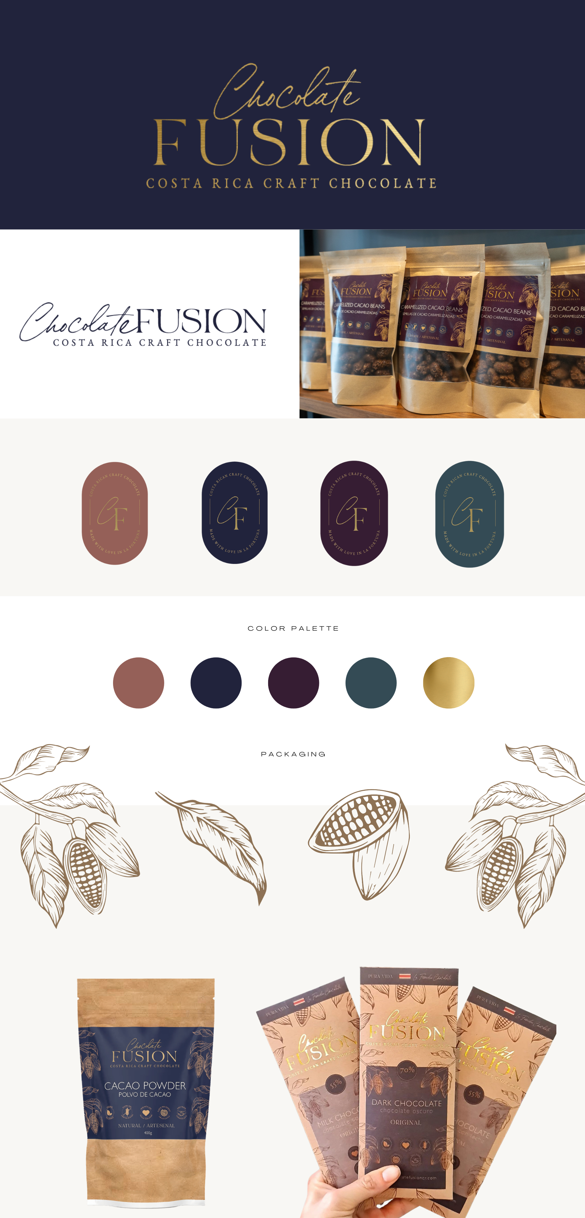
Like many businesses, Chocolate Fusion was organically created one step at a time by a hard-working husband and wife team. The logo and brand evolved as they did, and was recreated by printing shops almost every time they printed off new packaging. Because of this, their branding was not consistent and did not reflect their core values, personality, and the needs of their clients, nor did it offer a competitive edge. They now have a consistent beautiful brand that will stand out from the competition and win the hearts of new loyal customers.
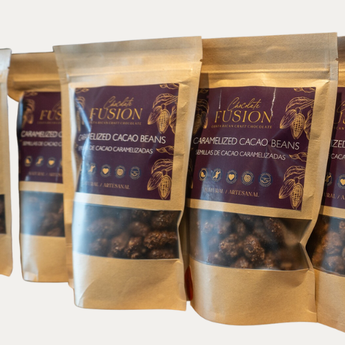
For the past 10 years, Chocolate Fusion has been one of La Fortuna’s busiest coffee and chocolate shops. The moment you step into their recently renovated and professionally designed store, you can feel their brand personality: elegant but accessible, modern but timeless, rustic but chic, family friendly, creative. This, paired with brand strategy is exactly what determined all of the branding decisions, especially the contrasting combination of recycled kraft paper packaging mixed with embossed gold printing.

Brand Guide

